I.C.T. Department


Main Menu

SPIRIT in ICT

Departmental Expectations

Year 7

Year 8

Year 9

Year 10

Year 11

Technical Specifications

This page is intended to be used by students and staff who would like to add pages to the Horbury Interactive site. It is a technical document and as such contains complex language and definitions.

It is important that Horbury Interactive users are presented with a uniform and consistent browsing experience. New pages added to Horbury Interactive must conform to these rules.

Page Layout

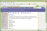
Horbury Interactive has been carefully designed so that it is easy for you to use.

The page layout is also easy to maintain, and several features are generated automatically by the web server.


Top Navigation Bar

The top navigation bar is dynamically generated using javascript when the browser loads the page. It will not normally be possible to alter the appearance of the top navigation bar. For a detailed list of features, please refer to the Horbury User Guide pages, by clicking on this link.

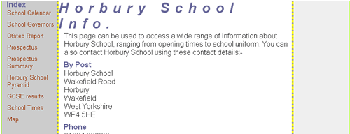
Main Page Title

This should appear across the top of every page. The style used is as follows:-

Font : Ariel 24point
Background colour

#666699

Foreground colour

#9999CC

Right and left border

thin, solid #99FF00

Top padding 8 pixels
Bottom padding 3 pixels
Margin left 8 pixels

Heading styles should not be used in the main page title.

Main Section

The main section of the page is split into three columns, with the third column being optional.

The total width available is 760 pixels which should fit into a browsing window shown maximised on an 800 pixel width display.

The left and right column are 120 pixels wide.

Left Column

Font : Ariel 10point bold
Background colour

##CCCCCC

Foreground colour

#666666

Left border

thin, solid #99FF00

Right border

medium, dotted #999999 *

* the table has a yellow background colour, which results in a yellow and grey dotted effect

Right Column

The right hand column is optional, but if it is included should contain "value added" links. These could be external links to pages related to the main theme of the page, or links to additional pages hosted on the Horbury server.

Pages with learning interactions can also use this area to to display navigation systems, user feedback and feedback of results.

Font : Ariel 8point bold
Background colour

##F0F0F0

Foreground colour

#666666

Right border

thin, solid #99FF00

Left border

medium, dotted #999999 *

Bottom margin 8 point

* the table has a yellow background colour, which results in a yellow and grey dotted effect

Central Column

The main styles that are used should be:-

<p> paragraph

Ariel 12pt #333333
left margin 12pixels
bottom margin 9pixels

<h1> main heading

Ariel 30 pixels Italic #666699
font-size: 30px;
font-style: italic;
letter-spacing: 0.75em;
word-spacing: 0em;
white-space: normal;

<h3> heading

Ariel 24 pixels Bold #FF0000;
text-indent: 4pt;

<h5> heading

Ariel 16pixels #666699
text-indent: 8pt;

<ul> bullet lists

Ariel 12point Italic #990000
Bullet style
(custom style)

a:link

#0000FF;
text-decoration: none;

a:visited

#993300;
text-decoration: none;

a:hover

#FFFFFF;
text-decoration: underline overline;

#0000FF
background colour

a:active

#FFFF00;

#0000FF
background colour

Accessibility

Designers must be aware that the worldwide audience of Horbury Interactive will have many and varied needs. Some users may be using braille readers, screen talkers or high contrast displays to "view" the pages.

Please bear the following points in mind:-

  • If you use a tables to control the layout of your page, you should make the layout as simple as possible, and the text that is contained within the table should make sense when it is read from left to right, which might happen if a machine reads the page for a VI user.
  • All images on your page should have an <ALT> tag that describes the image, unless the image is only used for structure, i.e. background images.
  • Consider adding a <LONGDESC> tag to your images so that a VI user can read a longer description of the image.
  • Hyperlinks should have a meaningful text description, such as "click this link to see some more examples of colours", instead of just "click here". Wherever possible, you should also include the hyperlink, because your site visitor may be unable to use the mouse to click on the link.
  • email links should have the full email address displayed because your visitor may be unable to click on the link to automatically load their email client program.

Useful links to Accessibility related pages

Click this link to display a full list of colours to illustrate different colour contrast

Lighthouse International

Changing Your Browser Settings To Increase Legibility
http://www.lighthouse.org/about_browser.htm

Designing for People with Partial Sight and Color Deficiencies
http://www.lighthouse.org/color_contrast.htm

Designing for People with Partial Sight
http://www.lighthouse.org/print_leg.htm

World Wide Web Consortium

Web Accessibility Initiative
http://www.w3.org/WAI/

Web Accessibility Initiative Guidelines
http://www.w3.org.tr/wai-webcontent

BT Exact

Safe Web Colours for Colour Deficient Vision
http://innovate.bt.com/people/rigdence/colours/

Web Design (very good page)
http://innovate.bt.com/projects/webdesign.htm

Royal National Institute for the Blind (RNIB)

See It Right Accessible Website Scheme -
http://www.rnib.org.uk/digital/siraccess

Campaign for Good Web Design
http://www.rnib.org.uk/digital

Hints for Designing Accessible Websites
http://www.rnib.org.uk/digital/hints.htm

List of Access Technology -
http:// www.rnib.org.uk/technology

List of Suppliers of Access Technology
htp://www.rnib.uk/techshare/suppliers.htm

Vischeck

Vischeck simulates colorblind vision.
http://www.vischeck.com/

Visibone Web Colour Chart
http://www.visibone.com/colorlab/